Wednesday, November 28, 2007

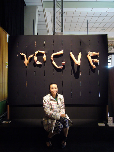
Limb Type


Making letters? Out of arms? And maybe legs? Who'd a thunk it?

Click the title kids.

Monday, November 26, 2007

TypeTrust

Typetrust have a sale of some sorts going on. It's still a bit pricey but there's some nice typefaces up there should anyone wish to take a look

http://www.typetrust.com/

Friday, November 23, 2007

Roma--Typographically Speaking

Some of the type i encountered in Rome


Thursday, November 22, 2007

Ta for the invite Chris, I tried to look for type in Rome, honest I did...More examples to follow soon!


Tuesday, November 20, 2007


i found the work on this site quite interesting..


and here....


and i thought this was an interesting project with regards to the idea of collaborative work, and the discussion of creating a shared body of work...


http://www.tabrez.cc/26letters/


enjoy

RIP RYAN SPACEY

examples of shapes and type in the urban enviroment

http://www.myfriendpike.com/self-initiated.html


http://www.you-are-beautiful.com/NEWS.htm


check out crumpler animated alphabet

http://www.crumplerabc.com/

everyone check this link out. its an animated alphabet. may give you loads of ideas about things that you want to try out by ya selves or in our type club.

Sunday, November 18, 2007

example of shapes as letter


ok first off, I did have this idea before I saw this on type workshop by the way. it is an example of using shapes and negative space to make letters.

whats the plan stan

well the plan is guys.

to do a little type basics with you guys for a while still. However the whole reason why i started this group was to collaborate with people. So I will have prepared something for us all to do on tuesday.
An approach to type and letters that i like to take is looking at shapes that you can arrange together to make letters. Someone has already done this in the group by making letters out of postit notes. So with the theme of time and reality, (my studio project) on a grid pad we are going to make letters from cut up shapes and numbers.

I'll be photographing it all so put on ya best make up pat. hahaha

type basics

Hello everyone.

ok I need to step things up a bit with this type club. I am not lazy, just very busy, which is why some of you are admins on this site as I just can't do everything my self, nor do I want to. I don't want to be a teacher, but I am aware in order to get some fruitful outcomes from this club, people to need to learn things about type. So as pat pointed out avva look at typeworkshop.com
I have nabbed some of their design basics posts and put a few up on here to show you but everyone check the site out. Hopefully we will have outcomes like that soon. it's early days at the moment though.

I will photocopy a few of them and make a few handouts for the ones that don't check the blog much.


"Spacing. Some words about spacing type. Much more important than the shapes of the characters, is the rhythm of the type. A typeface with beautiful characters which are badly spaced is extremely hard to read. However, if the shapes of the letters are not that good, but when they are all perfectly spaced, the type will be fairly easy to read. Defining the rhythm is more important than defining the shapes.

The white spaces inside and in between letters are defining the rhythm, much more than the black shapes of the letters. When you manage to create a good rhythm in your line of text, your type gets more readable and gives a balanced end result. While creating the black shapes, you have to take the white spaces into consideration. Because the white spaces are more important than the black shapes. However, white cannot exist without black. Changing a white shape, inevitable will have an influence on the black shape. From that perspective, one colour cannot be more important than the other.

For example, there has to be a relation between the space inside an 'n' and the space between the 'i' and the 'n' (see drawing). In the top row you can see the space inside the 'n' is much much bigger than the space in between the 'n' and the 'i'. In the bottom row they are much more equal, and in this way you'll get a much better rhythm and more harmony in your line of text.

The same goes for the inner form of the 'a' and the 'e' for example. There is a big relation between these two forms. If they have (optically) the same amount of white inside the character (=counter), your type will have a better rhythm as well."


Friday, November 09, 2007

Wednesday, November 07, 2007

grid typeface

The last type meeting at Leeds Met was good. We started to generate some interesting type faces with the grid paper. It would be great if these could be developed further and at the next meeting we could discuss the strengths and weaknesses of the work. I hope some of you might try and draw these up in illustrator for further experimentation.

I suggested to Chris Goodwin that we could use these new type faces within a poster design, It’s important to see your type functioning to see if it actually works. After the Rome/Lisbon trip I’ll be presenting two layout/grid seminars, I hope you’ll all try and catch them.

For the person who was drawing the block type, sorry can’t remember your name, have a look at the 'Block Up' typeface. It was designed by Sally Ann Grover in 1974 for Letraset. Here is a link to a digitised version http://www.dailyfreefonts.com/fonts/infos/1366-Block-Up.html. There is also an artist called Paul Noble who has used it within some large scale drawings. http://www.whitechapel.org/content.php?page_id=957

Tuesday, November 06, 2007

chris tosic banners


Singularity (title linked)

sign up, sign up.

The guy who previously ran the group has left/is leaving but would still very much to keep the group alive somehow. It's thrown up a few interesting discussions since its conception with regards to type and it's a great way to encourage collaborations with other university students around the country too should you wish it.

I'll have a word with Mike tonight if I can with regards to the current mod state of the group, but it'd definitely be great if we could revive it somewhat.

Blog banners

Get your banners emailed in!
Chris's and mine here:

Chris' Banner
Pat's Banner

Thursday, November 01, 2007

Bundlatype.

A few recent favourites:

Jenny Cobden:


Fei Liu:


Letter by Circle:


Studio Helmich:
Viva La Resistance series:
"These are sketches for one of my graduation-projects.
I started out with a huge subject: individualism.
I'm approaching this subject by letting people (individuals)
be part of a group, without them knowing it.
They are part of a group by wearing clothes which have two characters
of a word printed on them.
Together, the characters form a word, a phrase, a statement."


Keep checking other design and art blogs:

Manystuff
The Serif
Form Fifty Five
VVORK

Hand drawn type

Some examples of nice hand drawn type I found.


Hannes Gloor


Onomatopee


Clovis Vallois

I'm quite a big fan of hand drawn type because of my limited knowledge of decent typefaces, plus they're always completely unique. Apologies if you've seen these already on Manystuff